19.5 Broken-line graphs
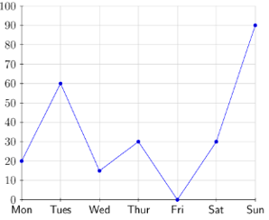
Broken-line graphs are data graphs that represent data points joined by a line. It is important to note that
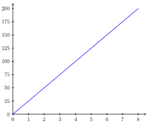
broken-line graphs are not the same as straight-line graphs.
| Example of a broken-line graph |
Example of a straight-line graph |
 |
 |
Broken-line graphs are used to represent data that change continuously over time, such as the average daily
temperature for a week, or a person’s heart-rate for a day (i.e. continuous data). Each data value is
represented by a point on the graph, and the points are joined by straight line segments to make a broken-line
graph.
Broken-line graphs are useful for identifying trends and patterns in data sets.
Worked Example 19.6: Drawing a broken-line
graph from a table
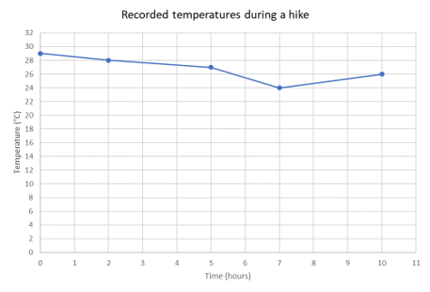
A group of friends went on a \(10\)-hour hike. They recorded the temperature at certain times during the
hike. Represent the given information as a broken-line graph.
| Time (hours) |
Temperature (\(^{\circ}\text{C}\)) |
| \(0\) |
\(29\) |
| \(2\) |
\(28\) |
| \(5\) |
\(27\) |
| \(7\) |
\(24\) |
| \(10\) |
\(26\) |
Identify labels for the horizontal and vertical
axes.
The table shows the time and the corresponding temperature reading during the hike. The time (in hours)
will be on the horizontal axis and the temperature (in degrees Celsius) will be on the vertical axis. Notice
that the change in temperature depends on time.
Determine a suitable scale for the vertical axis.
First, we need to determine the range of temperature values. The lowest value is \(24 ^{\circ}\text{C}\)
and the highest value is \(29 ^{\circ}\text{C}\). So for the vertical axis we can use a scale from \(0
^{\circ}\text{C}\) to \(32 ^{\circ}\text{C}\) with intervals of \(2 ^{\circ}\text{C}\).
Draw the broken-line graph.
Test yourself now
High marks in science are the key to your success and future plans. Test yourself and learn more on Siyavula Practice.
Sign up and test yourself
Exercise 19.1
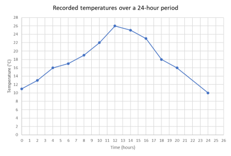
Use the broken-line graph to answer the following questions.

- What was the temperature after \(4\) hours?
- What was the minimum temperature during the \(24\)-hour period?
- What was the temperature after \(10\) hours?
- What was the maximum temperature during the \(24\)-hour period?
- At what time(s) was the temperature \(18 \text{ °C}\)?
-
\[16 \text{ °C}\]
-
\[10 \text{ °C}\]
-
\[22 \text{ °C}\]
-
\[26 \text{ °C}\]
- At \(7\) hours and \(18\) hours
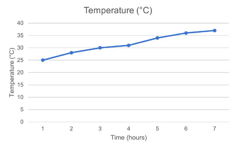
Represent the data given below as a broken-line graph.
| Time (\(\text{h}\)) |
Temperature (\(^{\circ}\text{C}\)) |
| \(1\) |
\(25\) |
| \(2\) |
\(28\) |
| \(3\) |
\(30\) |
| \(4\) |
\(31\) |
| \(5\) |
\(34\) |
| \(6\) |
\(36\) |
| \(7\) |
\(37\) |
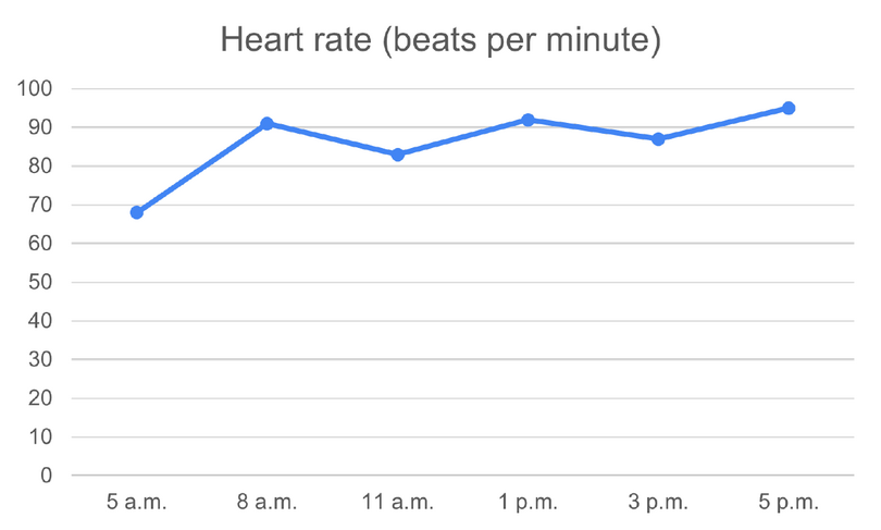
Use the table of values to draw a broken-line graph.
| Time |
Heart rate (beats per minute) |
| \(5\) a.m. |
\(68\) |
| \(8\) a.m. |
\(91\) |
| \(11\) a.m. |
\(83\) |
| \(1\) p.m. |
\(92\) |
| \(3\) p.m. |
\(87\) |
| \(5\) p.m. |
\(95\) |
